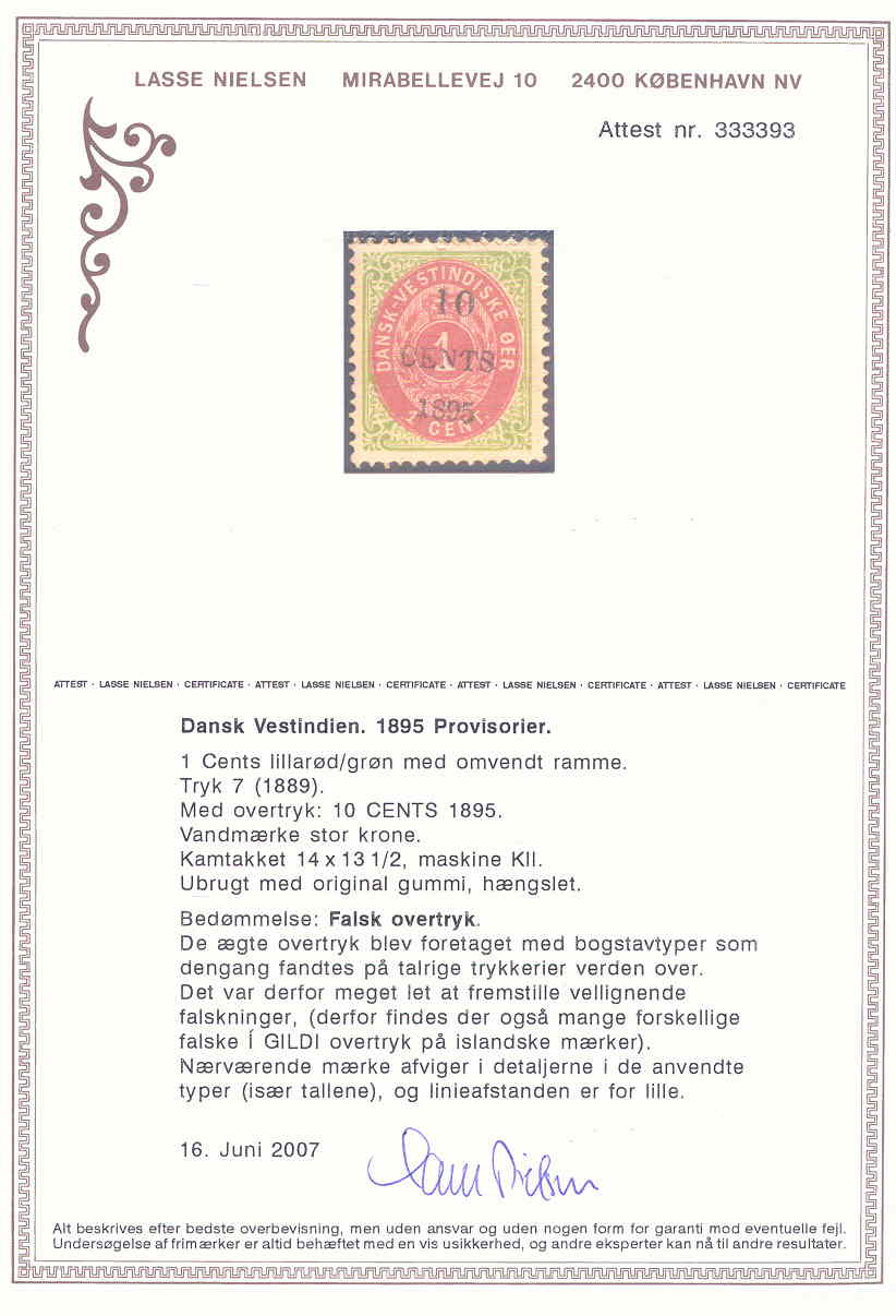
SOMMERGÅDE – DVI 10/1c7 ÆGTE ELLER FALSK?
Nedenfor viste mærke har vi erhvervet denne week-end.
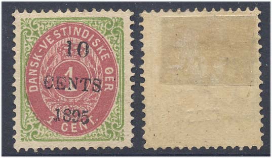
Som det ses drejer det sig om et prøvetryk 10 cent på 1 cent, men ikke som normalt på tryk 8, men på tryk 7.
Den første reaktion var, at det måtte dreje sig om en forfalskning, da overtrykket hælder en anelse mod højre, hvilket tydede på et ”håndtryk”.
Bagsiden viser dog, at det formodentlig er tryk på maskine. Det drejer sig altså ikke om et ”ægte” overtryk, der er fotokopieret over på et mærke.
En nærlæsning af Lasse Nielsen bragte følgende for dagen:
”Overtrykket forekommer med stor lodret forskydning, så årstallet står foroven på mærket i stedet for forneden, (mærker fra øverste række i arket vil i stedet helt mangle årstallet). Meget skæve overtryk forekommer også. Begge dele er antageligt makulatur, som er sluppet ud.”
Vi er i hvert fald spændte på at ”nærlæse” mærket, når det kommer ”hjem”.
Med venlig hilsen
Hans Mortensen
Hej Lars,
Det lader til at interessen for det nye 10 på 1 cent tryk 7 (muligvis pos 74), vi sendte dig i går, er stor.
Vi har inden for det sidste døgns tid fået forespørgsler fra flere DWI-samlere i den store verden.
Hvis mærker er ægte – vi sender det naturligvis til prøvning hos Lasse – hvilket vi har diskuteret med Bernd den seneste uges tid.
Vores opfattelse lige nu, hvor vi endnu ikke har haft mærket i hånden, er at det er falsk, men Bernd er ikke 100% sikker på at det er falsk, tværtimod..
Skulle det vise sig, at det er ægte, så er det en nyopdagelse, som vil give genlyd.
Med venlig hilsen
Inga og Hans
Hej Lars,
Har her til morgen modtaget nedenstående kommentar til det ”nye” mærke.
Hello Hans,
Thank you for your reply. If you are going to have the stamp expertized by Nielsen, then you should be safe. Before it was sold, I spent some time discussing it with Jim Broden ("fiddlerstrings" on ebay), and he first noticed that it was an inverted frame, and so could not be print VIII. We both thought the slanted overprint did not seem correct.
I finally did a careful examination after the sale, and compared it to the stamps I have (all are print VIII, all have the "climate spots" as mentioned in Facit). In case it is of value to you, here is what I found:
Despite the oval color looking like lilac, I say it's Print VII, position 84 (inverted frame). The upper right central plume is cut off on essentially all of print VII, whereas only two positions on print IX have anything like it, and neither matches. At the base of the inner right side frame line there is a blob connecting it to the curlicues on the left. This is most like 39.118 in Nielsen, but that doesn't match to the oval for the corresponding position 83. 39.117 has only a speck in Nielsen, but if the frame is heavily enough inked or the spot has grown over the print run it can make it into a blob; in any event the oval for position 84 has no characteristics, so it's my choice.
As for the overprint, the "10" should either be 2.2 mm high (same as "1895"), or 2.9 mm. My measuring of the scan suggests it's around 2.7 mm. The overall height of the entire overprint looks a bit too small for the small "10" variety, and much too small for the large "10" version. The letter "N" in "CENTS" is short at the bottom right, whereas most of the overprints are either level with the bottom left or more often longer than the left side. And of course there's the slant to the overprint, which I can't recall seeing in any of the printed overprints of any issue. (The "1 CENT" on 7 cents is a handstamp, so it's at all sorts of angles.)
From this, I conclude it is a fake overprint. There is a brief mention in the Engstrom "Danish West Indies Mails" Vol. 3 that any essay overprint not on print VIII is fake, so this is not a new problem. But I have never seen one before.
If Nielsen says anything different, could you let me know? It is always good to have more knowledge! Thank you very much.
Dan Braden
Hej Lars,
Kommentar fra zbidder.
Hi--Am interested (from a research standpoint) in the DWI 1895
overprint essay you purchased earlier today. All of the published
research I have seen to date indicates that the overprint occurs
only on printing VIII of the underlying 1 Cent stamp, which only
occurs with normal frame. However, the subject example, as you
probably noted, has an inverted frame and, based on the scan, may
have come from the earlier printing VII or later printing IX. Both
of these are primarily inverted frame printings. Even Lasse
Nielsen's recent books on the bi-color stamps only mentions the
normal-frame printing VIII for this particular essay. So, either the
earlier research is wrong or the overprint is a fake. Would very
much appreciate learning which is correct (when you find out, of
course).
Thanks in advance for any
feedback.
Hej Lars,
Nedenstående min diskussion med Dan Braden:
Thank you for your mail. I tend to agree with you both, but from an other angel. My overall impression are that the types used are slightly different from the original types used.
The zero in 10 are more round than I’ve seen in the other prints – and I have both 10/1 Cent print VIII (one copy) and a lot of 10/50. Further more the letters in CENTS also looks a bit different and the 9 in 1895 too, but all this might mean nothing due to the fact that you have overprints with two different sizes of !0, which means they have experimented with the typecast, at least of the value numbers. The CENTS and 1895 have been stable at a very early point see, 10/1, 10/50, 2/3 and 8/10.
So I still thinks it’s a fake, but a good one, close enough to the original to convince. What I hope for are that the fake are made around the same time as the original and not many years later.
Hello Hans,
You make a good point about the letters in "CENTS". I have several copies of 10/1, and the arrangement of the letters is different from the 10/50 as issued. I compare the exact lettering of "CENTS" and "1895" to the Nielsen plating of the 10/50 overprint setting, and they do not exactly correspond--but I find it is the setting of the letters and numbers that is different, not the actual type used. This is best illustrated by one 10/1 I have where the "TS" is lower than the "CEN", which does not occur anywhere in the 10/50. But the individual letters are the same as the 10/50. So I believe the 10/1 used all the same type as the 10/50, but the printer reassembled them for the 10/50.
If you read Nielsen in his Bicolor book (Vol. 1, page 274) about the 2/3 1901 proof, he discusses a block of four in Hagemann's collection that shows the setting of the 1901 proof was different from the issued 1902 overprint. But the type used is evidently the same, as the narrow E is clearly the same in both examples Nielsen refers to.
So maybe you can ask Mr. Nielsen about this. I believe the ebay stamp uses a different type--similar, but not the same--and so cannot be an "experiment" in the local printing office at St. Thomas, for instance. That leaves the time and source of its creation open to question, as you mention. It is probably old, because now they would know to use print VIII.
This reminds me of the problem of which rare "I GILDI" overprints from Iceland are properly genuine. There is a theory now that some stamps were overprinted with the original type, but not as part of the official print runs, so it may have been a private operation at the printing office. The evidence is that some of the rare overprints do not correspond to any of the overprint settings from the common stamps, which they should do. But of course the value of the Iceland stamps is many times more than our DWI proofs!
Thank you for sharing your thoughts with me.
Dan Braden